Analysis Outputs and Insights

Visual outputs generated from the churn pipeline, along with business interpretation of model results.

Best Insight: New customers and high monthly-charge users show higher churn risk.

Model Snapshot

0.7946

Logistic Regression Accuracy

0.7584

Random Forest Accuracy

0.7887

Random Forest ROC-AUC

26.58%

Overall Churn Rate

19.80%

High-Risk Segment Share

Detailed Model Evaluation

  • Logistic Regression Accuracy: 0.7946
  • Random Forest Accuracy: 0.7584
  • Random Forest Precision: 0.5491
  • Random Forest Recall: 0.5080
  • Random Forest F1 Score: 0.5278
  • Random Forest ROC-AUC: 0.7887

Interpretation: Logistic Regression gives better overall accuracy, while Random Forest is used for richer non-linear signal discovery and feature importance analysis.

How To Read This Analysis

  • The base dataset is Telco Customer Churn and is adapted to OTT/SaaS style business questions.
  • Features such as usage frequency, last login days, and support calls are engineered proxies.
  • Each visualization highlights one churn driver; model metrics validate predictive reliability.
  • Risk segmentation converts model probabilities into actionable retention groups.

Visualization Outputs

Churn rate distribution chart

Churn Distribution

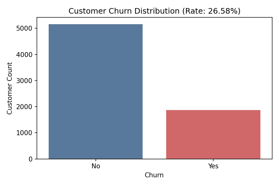
Shows churn and non-churn customer counts with overall churn rate.

  • What to observe: the gap between churned and retained user counts.
  • Business meaning: around one in four users are leaving, which is materially high for subscription products.
  • Action: make churn reduction a core KPI for product and customer success teams.
Tenure versus churn chart

Tenure vs Churn

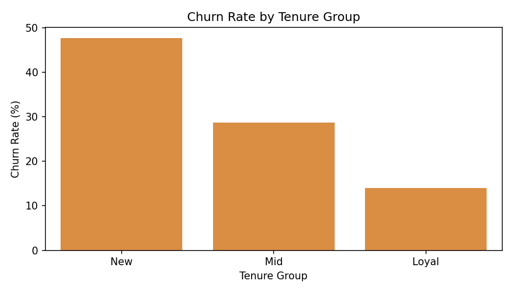
New users churn significantly more than loyal long-tenure users.

  • What to observe: churn is highest in early lifecycle segments.
  • Business meaning: onboarding quality and early value delivery are critical retention levers.
  • Action: launch first-30-day and first-90-day intervention journeys.
Usage frequency versus churn chart

Usage vs Churn

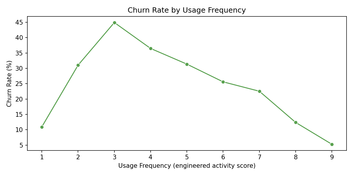
Lower usage intensity is associated with higher churn tendency.

  • What to observe: churn decreases as engagement intensity increases.
  • Business meaning: inactive users likely do not perceive enough product value.
  • Action: trigger re-engagement nudges, tutorials, and habit-building campaigns.
Monthly charges versus churn boxplot

Monthly Charges vs Churn

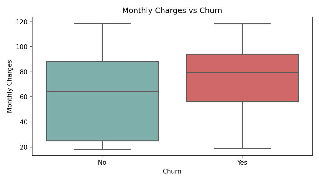
Higher monthly charges correlate with elevated churn risk.

  • What to observe: churned users are concentrated at higher price ranges.
  • Business meaning: perceived value may not justify cost for a subset of users.
  • Action: test pricing bundles, loyalty discounts, and value-communication messaging.
Support calls versus churn chart

Support Calls vs Churn

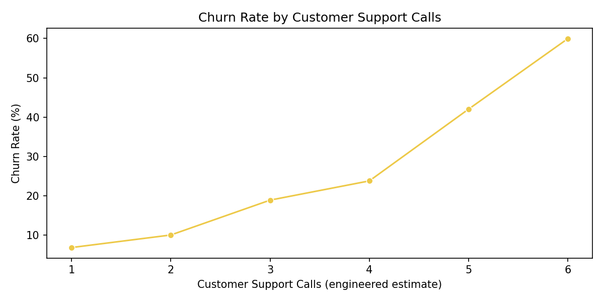
Frequent support interactions indicate higher dissatisfaction and churn risk.

  • What to observe: churn rises with repeated support contacts.
  • Business meaning: unresolved issues or product friction increase cancellation likelihood.
  • Action: prioritize first-contact resolution and proactive outreach for repeated-ticket users.
Correlation heatmap

Correlation Heatmap

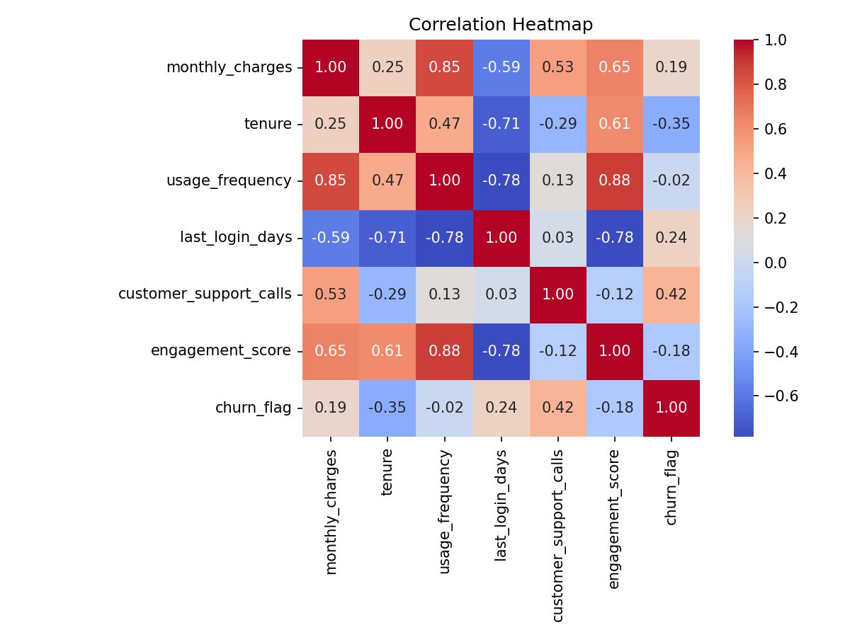
Highlights positive and negative relationships between features and churn.

  • What to observe: strength and direction of feature relationships.
  • Business meaning: helps shortlist strongest churn-linked signals for intervention design.
  • Action: use high-impact correlated features to design rule-based churn alerts.
Model accuracy comparison chart

Model Accuracy Comparison

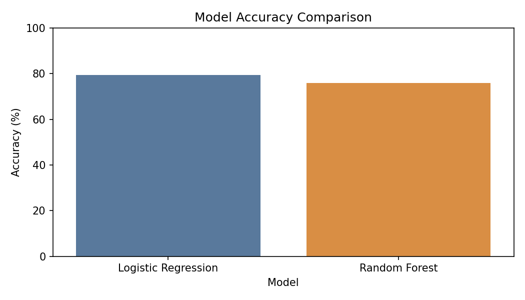
Compares predictive performance between Logistic Regression and Random Forest.

  • What to observe: benchmark difference between linear and ensemble models.
  • Business meaning: model selection can balance interpretability and flexibility.
  • Action: use Logistic Regression for explainability and Random Forest for signal exploration.
Feature importance chart

Feature Importance

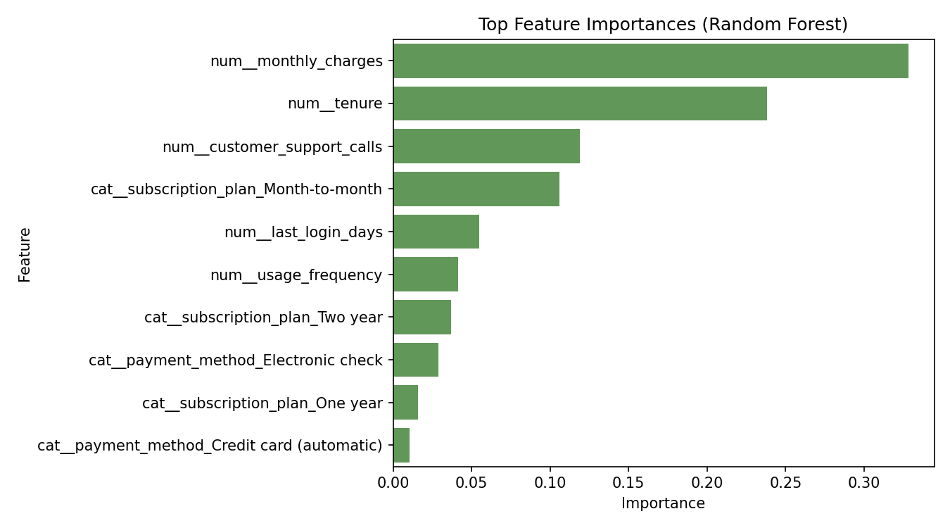
Top drivers include monthly charges, tenure, and support-related behavior.

  • What to observe: rank order of features influencing predicted churn.
  • Business meaning: highlights where product, pricing, and CX teams should focus first.
  • Action: align retention campaigns to the top five drivers for measurable impact.

Top Churn Signals Identified

Monthly Charges

Most influential feature. Higher monthly billing aligns with higher churn probability.

Tenure

Low-tenure customers are more vulnerable to churn, especially in early lifecycle stages.

Support Behavior

Rising support interaction levels are a strong dissatisfaction and churn warning signal.

Risk Segmentation Logic

Low Risk

Churn probability <= 0.40. Maintain with regular communication and loyalty offers.

Medium Risk

Churn probability between 0.40 and 0.70. Engage with targeted usage nudges.

High Risk

Churn probability > 0.70. Prioritize proactive retention, incentives, and human support.

Key Business Recommendations

  • Offer targeted discounts to high-risk monthly-plan customers.
  • Improve onboarding quality in the first 12 months.
  • Launch engagement campaigns for low-usage users.
  • Provide proactive support for users with repeated service issues.

Execution priority: Start with High-Risk monthly-plan customers, then roll out Medium-Risk engagement workflows.

Assumptions and Limitations

  • Some OTT-style behavior fields are inferred from telecom service attributes, not direct app telemetry.
  • Results are valid for this dataset distribution and should be re-evaluated for other markets or periods.
  • Threshold-based segmentation can be tuned based on business cost of churn and campaign budget.